The popup widget is an excellent tool to catch your customer’s attention without taking too much screen space and without breaking your customer’s shopping flow.
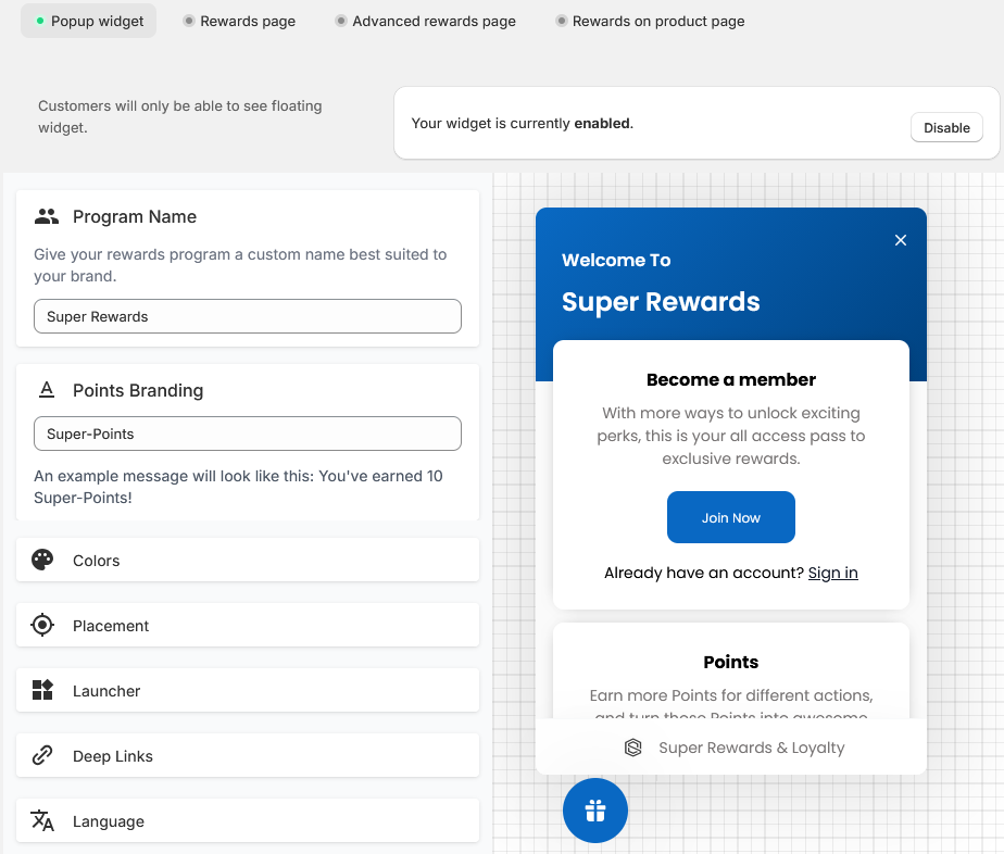
Settings
|
Setting |
Description |
|---|---|
|
Program name |
The name your customers will see as the reward program name. |
|
Points branding |
The brand name given to the points of your points program. Instead of simply seeing “points”, customers will see this name when earning or spending points. |
|
Colors |
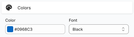
The widget’s background and font colors. |
|
Placement |
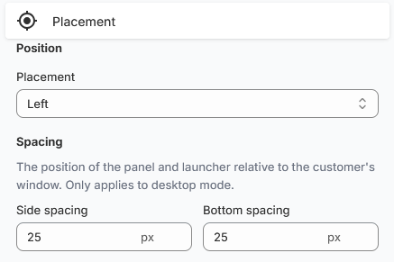
Dictates the in-page position of the widget.
You can use the Spacing fields to adjust how close or far the widget is from the edge of the screen. This is mostly useful if you have more elements like an accessibility widget or have information displayed on the screen edge you do not want the widget to hide. |
|
Launcher |
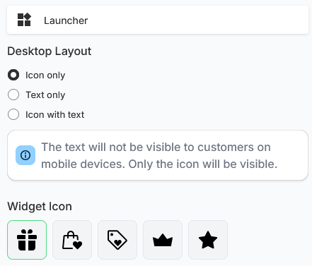
The launcher is the button that opens the widget.
On mobile devices, the launcher will only display the icon to save screen space. |
|
Deep links |
Deep links manipulate the popup widget to display specific pages. See Use deep links to display specific sections in the popup widget for a full example. |
|
Language |
Dictates in what language the popup widget will be translated to. |
|
Nudge |
The nudge is a small distinct pop up for new customers to invite them to create an account to join your rewards program. Nudge timeout dictates how long before the nudge is shown. Title and Description dictate what the nudge will contain. Set a custom nudge image to better match your brand. |
Additional settings
The Text customization and Banner/Cover image settings redirect you to specific pages where you can completely customize the popup widget’s text and the banner that shows up behind the popup widget’s title.